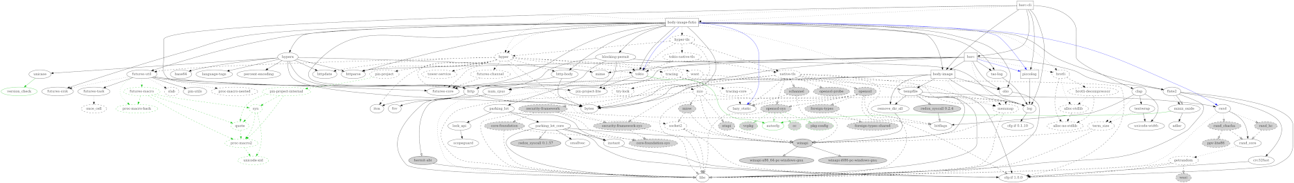
Vertically rendered so it fits the blog format and is mobile friendly, below. Guide level key features of the graph:
-
All (rounded box) nodes are (rust lang., crates.io) crates.
-
Colors of nodes represent rough ownership groups and common release practices;
mine,hyperium,tokio-rs,libs-teamish, etc. -
Dashed lines are dev-dependencies (only).
-
The
flabel means the dependency is feature dependent, and with(f)its a non-default feature. -
A red edge is one that is under review—we may be able to remove it in the future, which is almost always a net benefit.
Pro-Tip: We can produce an over-sized PNG to approximate the above vector graphics (SVG) quality, if hosting this directly in the github host repository proves necessary, though it really seems like github should have implemented an SVG security scanner by now.
In the graph, so far, dot has managed to keep the colored groups mostly together simply by dependency association (weight of intra-group edges.) In more complex cases, we might need to use sub-graphs to achieve the same effect.
There are many more crates not shown. Just the body-image project lock file has 109 crates total (some platform specific, non-default, etc.), so the above is less than ⅕ of the total. Most of them don’t cause enough trouble to be shown here, possibly just because they are infrequently updated, or they are leaf nodes of crates we don’t control. By selecting the important dependencies, we can better customize and read the graph. Compare to an automated tool showing all dependencies. Perhaps a more general interpretation would be the that the whole graph is too big for my best 4k monitor, but there are potentially many sub-graphs which can be extracted and custom formatted to make them both readable and useful.
I’ve been refining this almost daily for maybe two weeks now as I work through new releases of most all of these crates, and some other private and unrelated ones.
Or, on a large monitor, open the horizontally rendered version (frame) below in a separate window, or maximize the page and zoom in:
Pro-Tip: Node label line breaks (with
<br/>xhtml) are the key for orienting the graph horizontally in particular, making the nodes more square, reducing width and giving more direct paths for the edge splines.
Use cases
Be honest, you want this—in order to get organized and more easily:
-
Update crate versions and dependency version ranges based on a consistent, interior compatible strategy, by visually walking the graph in reverse arrow direction, from dependencies to dependees.
-
Identify subsets and make new releases in reverse dependency order (by visually walking the graph).
-
Intuit the best strategy for upgrading to originally incompatible new releases (or releases falsely claiming Semver compatibility, e.g. MSRV increases in patch releases of transitive deps, an all too common blight) from dependencies outside your control.
-
Find the root cause of duplicate dependencies in the overall graph, and infer the best strategy for removing them where possible, since they are either breaking (at worst) or a cosmetic and build time/size disadvantage (at best).
Potential Future Work
I’d like to see if an existing automated tool (ala cargo depgraph) maintainer
would be interested in adding enough cli flags, optional features, or
configuration to allow me to better automate the above without loss of
fidelity, even if subsequent customization to the output dot files remains
required. This is the default output of current cargo depgraph --all-deps on
body-image as a point comparison:
(Don’t squint—I can’t see anything either.)
Even with my current manually produced version, it might be revealing if it made the distinction between private (hidden) and public (visible in the API) dependency edges. (Yet another 3 year old, unstable, incomplete cargo RFC.)